Later this year we’ll be publishing a supernatural thriller novel called The Clearing.
Here’s the artwork for the front page, courtesy of Karri Klawiter. Hope you like it.

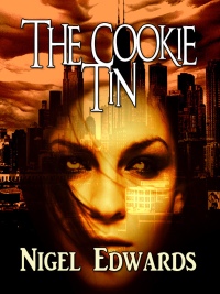
Later this year we’ll be publishing a supernatural thriller novel called The Clearing.
Here’s the artwork for the front page, courtesy of Karri Klawiter. Hope you like it.
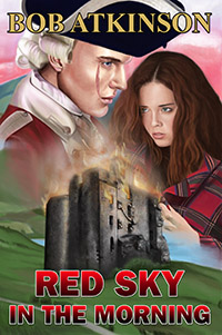
Alternative history romance in the Scottish Highlands

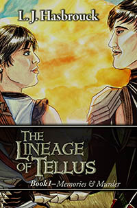
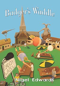
Illustrated high fantasy adventure.

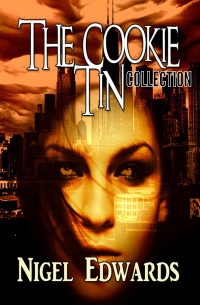
Literary historical mystery

Bestselling espionage thriller
High fantasy romance. Out now!
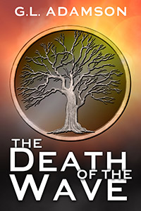
Dystopian literary science fiction. Out now!
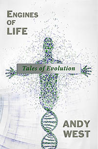
Philosophical science fiction collection
A short novel in the style of Terry Pratchett, Tom Holt, and Douglas Adams
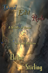
A novella of horror and good medicine.
18 double-espresso shots of verse.

A compendium of fantastic tales for young human adults. Out now!

There is no escape from... the DEATH FLU.
Out now!

In paperback and eBook
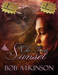
#1 bestselling time travel adventure in Scottish Highlands,1746 Out now in paperback and eBook
Speculative fiction collection. Paperback and eBook
SF-horror collection, a part of the Skyfire Chronicles. Available as eBook and paperback

Edgy horror novel ($2.99/ £2.06)

SF/horror novel. Paperback & eBook

YA High Fantasy eBook $2.99/ £1.71 Paperback $4.99/ £3.99

YA short fantasy. Click the image to read it here for free
A double-sestina poem. FREE!

Fantasy novelette 99c / 99p eBook. $4.99 paperback

SciFi time travel novels. Kindle: 99c/ 77p Paperback $9.99 / £7.99 Book2 out now!

SciFi novelette (FREE!)

SF short ($0.99/ 99p/ FREE)

Mayan poetry saga 99c / 99p
Urban fantasy novelette 99c / 77p

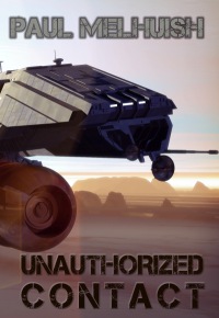
Sci-Fi novella

A ghostly novelette eBook 99c/ 99p Paperback $4.99/ £3.75

Horror short ($0.99/ 99p)

Dark fantasy short story ($0.99/ 99p)

Dark suspense novelette ($0.99/ 99p)

Horror short (99c /99p/ FREE)

fantasy novelette (FREE or $0.99/ 99p)

SciFi short ($0.99/ 99p)

SciFi horror short story ($0.99/ 99p)

YA SciFi Short (99c/ 99p/ PRIME)

SF short story ($0.99/ 99p)


I love it. The color scheme is actually reminds me a bit of the paperback cover to “Jonathan Strange and Mr. Norrell.”

That’s interesting. I read that a few years back. Loved the non-standard layout and original typeface, but mine was white on red http://photo.goodreads.com/books/1327945902l/14201.jpg There’s a white on black too. Why so many covers?
This looks like my sort of book, brilliant. I’d probably buy it just because of the cover. But if it’s a supernatural thriller I will certainly be getting it.
That’s what I like to hear!
Another very eye-catching cover. If possible, I would love to be a beta reader for this book.
Thanks, Bob. I’ll put you on the interested list.
I’ve been remiss because of my vacation, and I apologize for that. I think the cover is brilliant, and I couldn’t be more pleased. I plan on requesting Kari for all my future work, and I’m emailing her to tell her so. Thanks Tim 🙂
Wow. That’s quite a thumbs-up!
I think it’s a well-deserved one…:)
I think it’s a well-deserved one 🙂