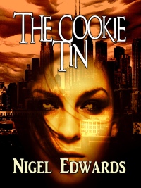
click for a larger image
There’s been another change to cover art today, No More than Human gained a new cover. I think it’s tidier, possibly less original but definitely smarter.
When we started, we had a common look of bright colour banding top and bottom, text in Weathered font, and our Greyhart Press logo top-left. What I’m trying to do now is free our covers from that constraint but also to let you know at a glance whether the book is a short story or not. Novellas and novels have the Greyhart band on the left, short stories don’t.
We’re still experimenting. Perhaps we’ll decide that’s too complicated. Let us know what you think…

An example of a novel cover
One thing I am sure about. When I first looked at self-published short stories available for the Kindle back in March, the standard of quality for covers and internal formatting was much lower than it is now. Many authors made absolutely no attempt at a professional cover. Several authors used a picture taken from a web cam and stretched it to fit the cover page! I myself bought several short stories (which to be fair I enjoyed reading) that didn’t have a cover at all. Things have moved on rapidly.
The internal formatting is better now. In fact, if you are a part of the eBook reader or writer communities you would know that most formatting groans these days are aimed at the major publishers, specifically when they do an OCR scan of a print book and rush out an eBook without copy-editing. The amateurs are often more professional than the professionals right now!
Of course, this is a moment in time, just as the period of the web cam covers. The eBook world in six months time will be different again. Greyhart Press will be a part of that future, and I hope you will journey there with us.
Tim
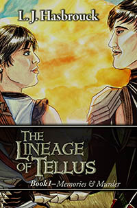
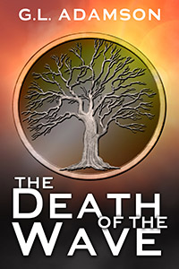
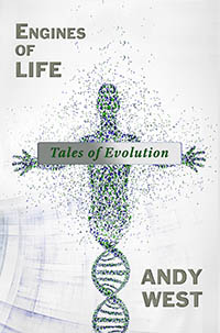
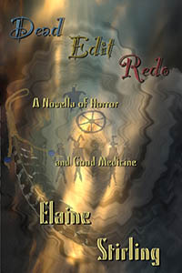
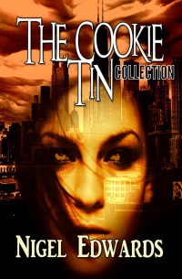
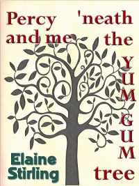
Here are some more covers and internal illustrations we’ve put together in the past few weeks (click to bring up a much larger version)